Redesigning how people organize insight
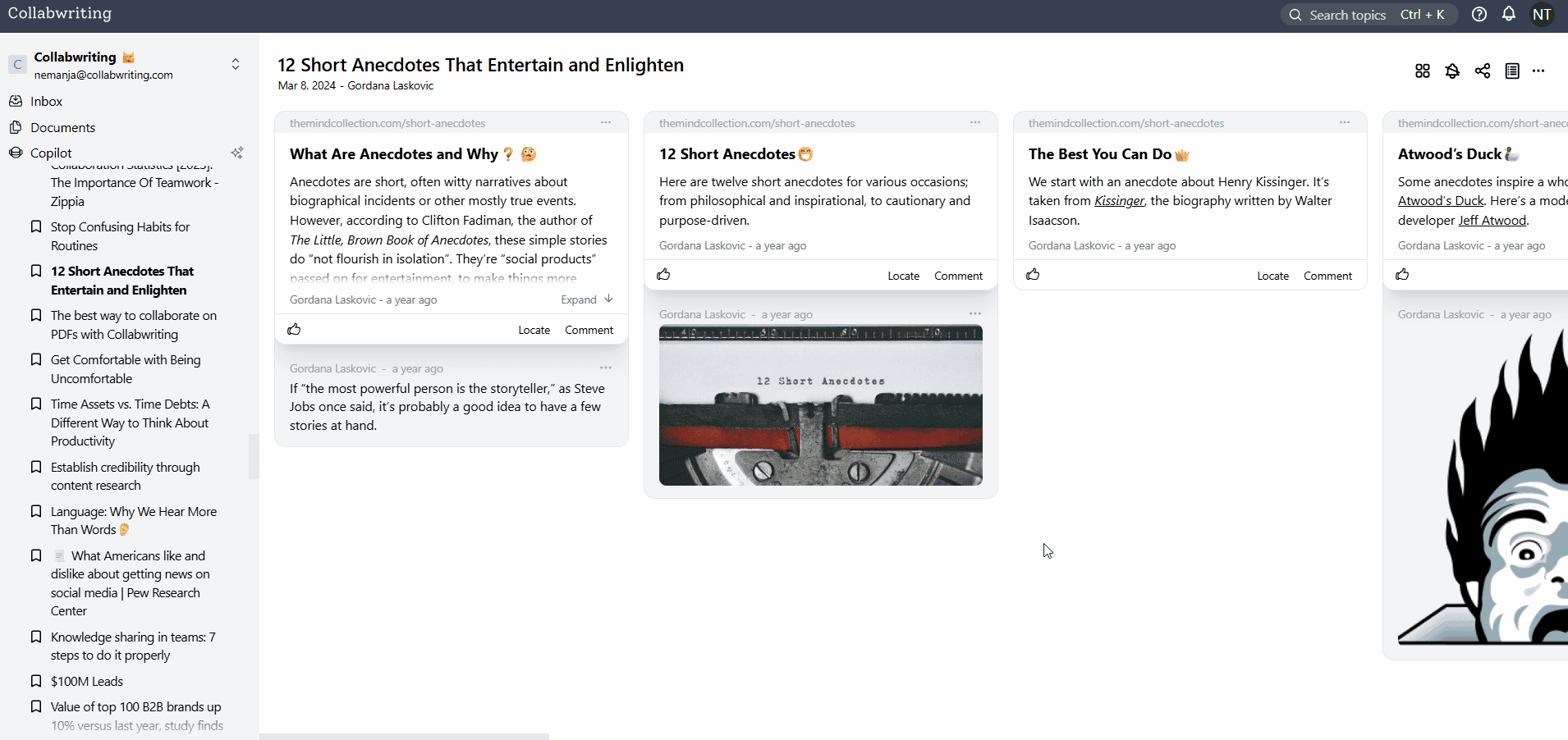
Collabwriting is a knowledge management tool helping teams capture, structure, and rediscover insights.
Role
UX/UI design lead
Timeline
February 2025 -
September 2025
Tools used
Results
30%
increased user
user activation rate
40%
increase in the
user retention rate
20%
increased developer
shipping time
100%
increased speed
in user research flow
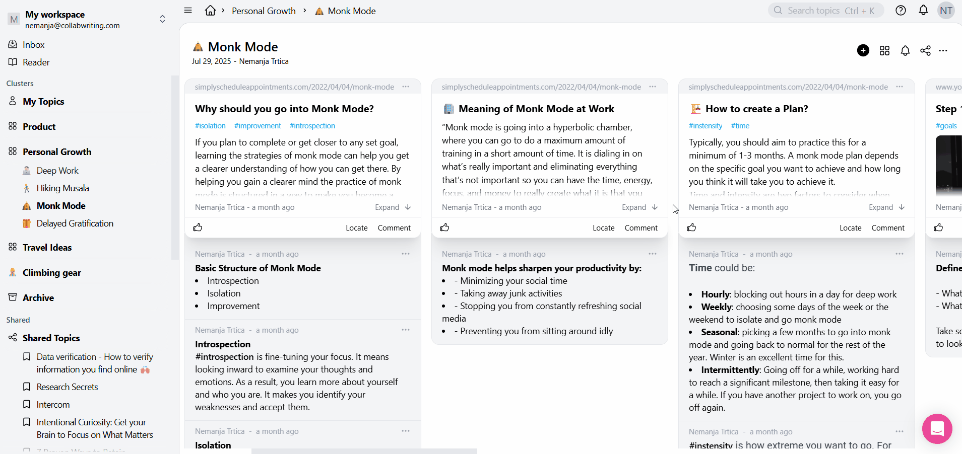
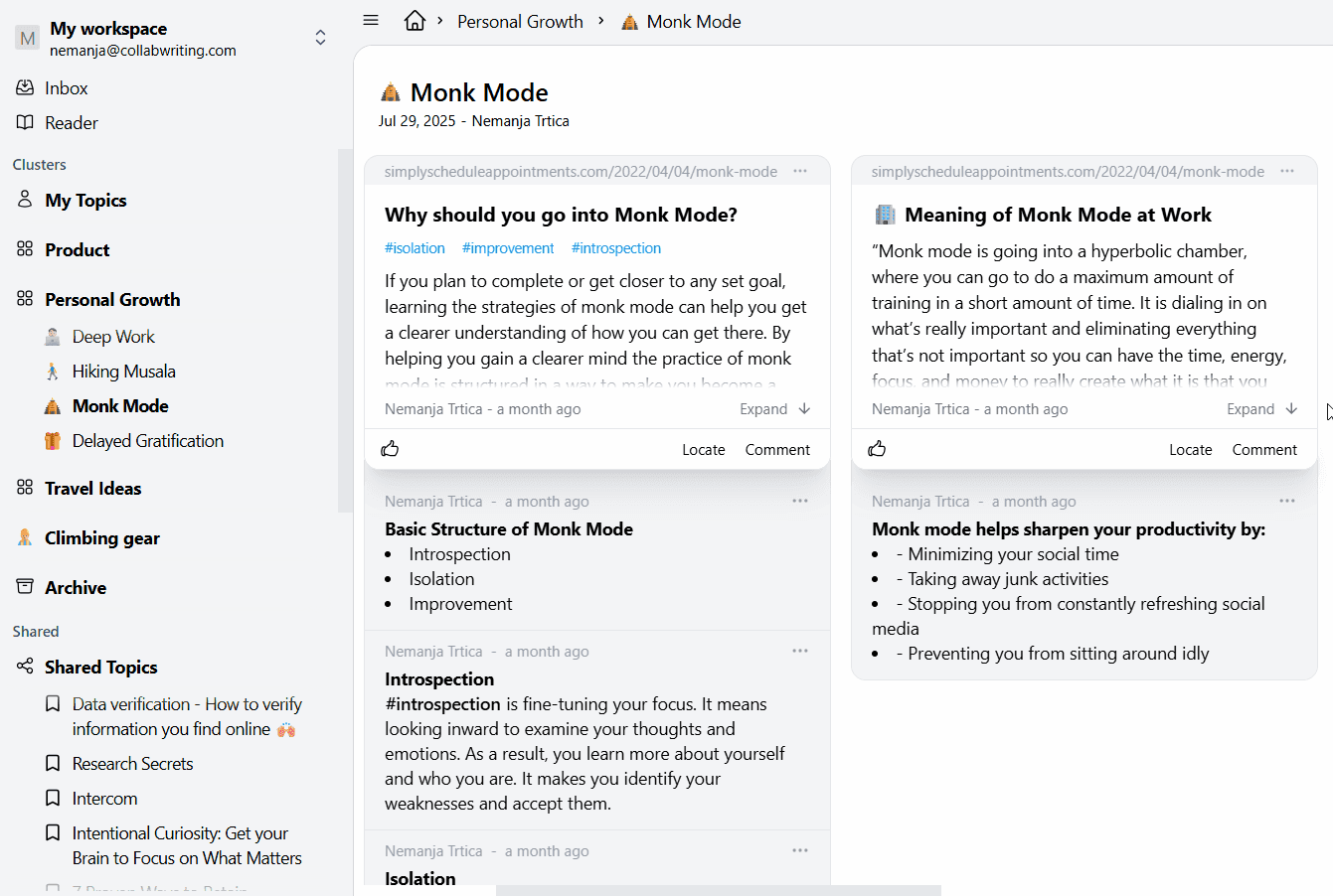
Context
Collabwriting was growing, but users weren’t activating or returning. The issue wasn’t a lack of features. It was fragmentation: people saved insights, but couldn’t organize, use, or retrieve them efficiently.
The big win
I transformed Collabwriting from a “note dumping tool” into a structured knowledge management system users trust daily.


Trusted by marketing teams, researchers, and legal professionals at established companies.
Problem
Collabwriting didn’t help people bridge Capture → Structure → Retrieval.
Collabwriting didn’t help people bridge Capture → Structure → Retrieval
Signals from data + feedback
Low activation (13%) showed early friction & unclear value
Retention dips tied to inability to “find what I saved”
Support logs full of “Where did this go?”, “I can’t find my topics”
Teams using PDFs, bookmarks, e-mails, posts, needed structure
18%
18%
22%
22%
16%
16%
14%
14%
18%
18%
17%
17%
25%
25%
21%
21%
16%
16%
16%
16%
17%
17%
10%
10%
User activation rates from February of 2025 to May of 2025
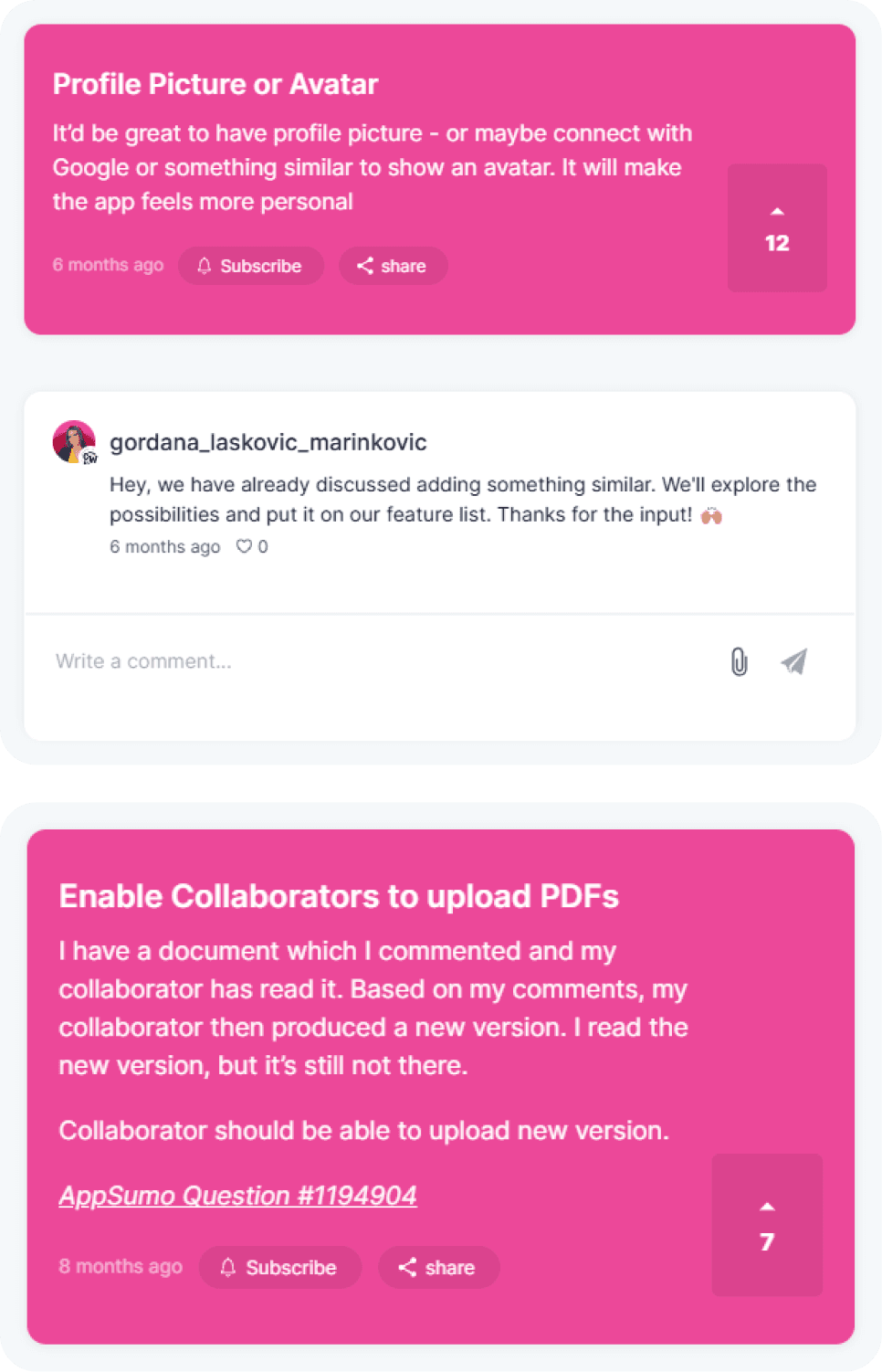
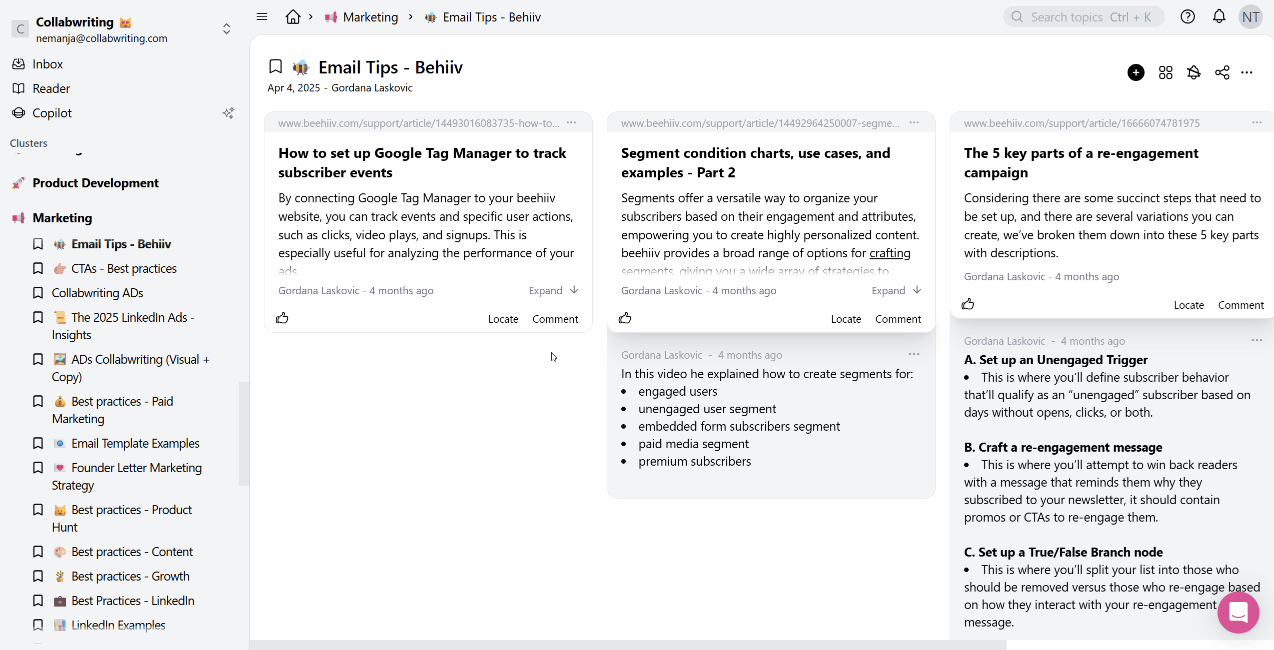
User Feedback
Via the Sleekplan app, I had access to suggestions from users about bugs, and features. Other community members could vote and leave comments. This way, I would know which features to prioritize.
The most important feedback came from team (enterprise) plan users. I worked with them on qualitative research: 1 on 1 calls and A/B testing. Those sessions helped me create 3 common user personas and their pain-points
The most important feedback came from team (enterprise) plan users. I worked with them on qualitative research: 1 on 1 calls and A/B testing. Those sessions helped me create 3 common user personas and their pain-points

Real user feedback from collabwriting.sleekplan.app
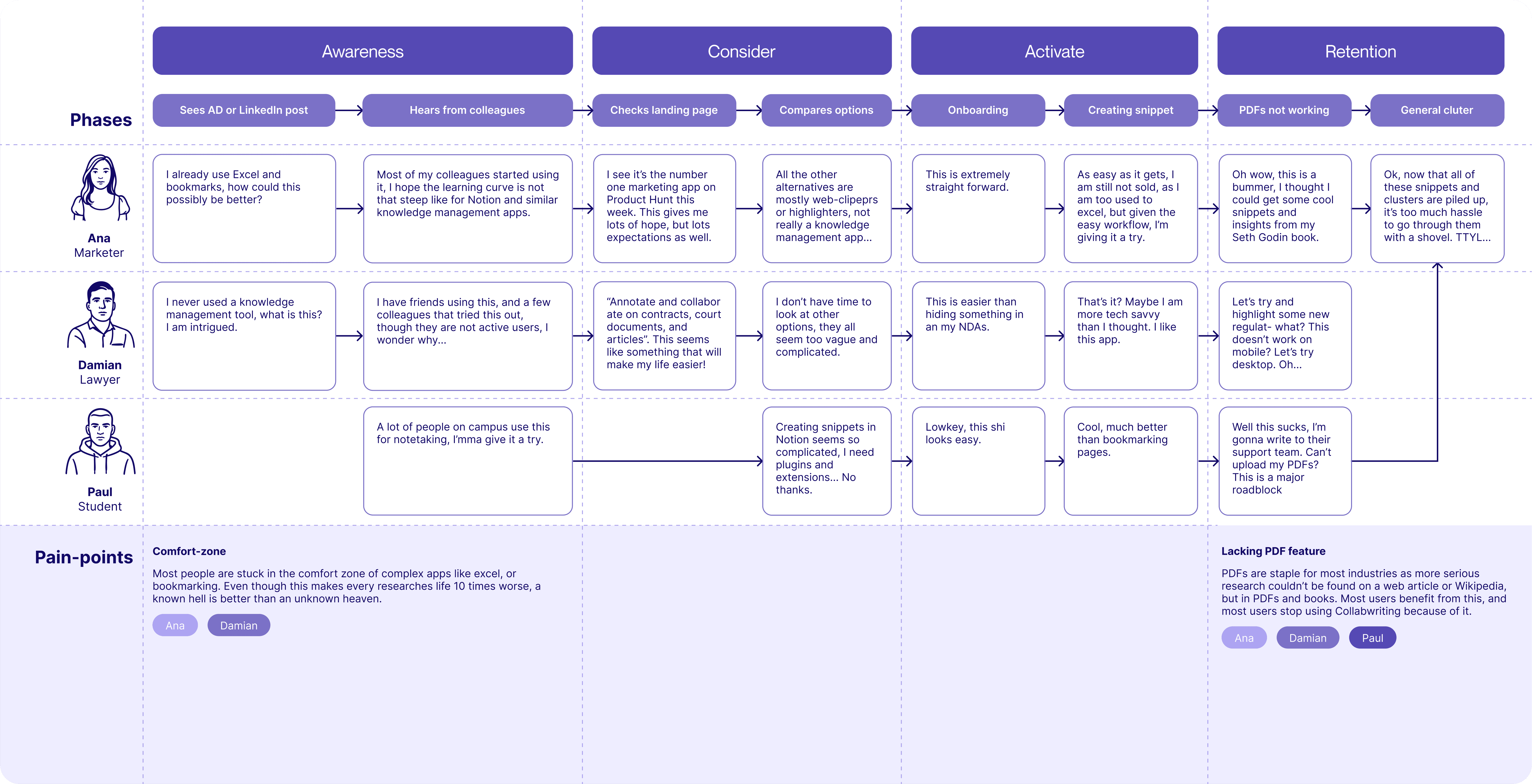
Personas
& Pain Points
Together, these personas reveal the system-level problem: users struggled to transform collected content into actionable knowledge.
Ana
Marketing specialist
Short bio
Collects insights from YouTube, blogs, LinkedIn. A million open tabs, messy research, no structure.
Pain-point
I don’t know where things go. I want one place where my research is actually usable.
Damian
Lawyer
Short bio
Reads long, complex laws and amendments which he collects as snippets inside of his dashboard.
Pain-point
I lose track of what I highlighted. My knowledge becomes scattered across PDFs, notes, and tabs.
Paul
Student
Short bio
Pulls insights from papers, lectures, forums. Lot's of knowledge nuggets but forgets where he saves them.
Pain-point
I never know where I saw something. Half of my research time is hunting for the other half.
Product strategy
Product strategy
To solve the chaos, I created a framework guiding all decisions:
The Retrieval Framework
Capture
Make it effortless to bring content into Collabwriting
(shortcut, quick-save, inbox)
Structure
Give users intuitive, visual ways to organize information
(PDF hub, tag buckets, icons, clusters, topic UI)
Retrieve
Make insights instantly findable and re-usable
(Inbox, dashboard redesign, AI chat, improved navigation)
Every feature feeds into this loop. This turns your “many features” into one strategic story.
UX Research
By mapping user behavior across marketers, students, and legal professionals, clear patterns emerged around organization and retrieval pain points. These findings shaped the core product direction and guided every major design decision that followed.
Insight 1
Users expected visual cues where they lacked. Especially Ana and students accustomed to Notion-like mental models.
Insight 2
Complex PDFs needed a dedicated workflow. Legal and academic users demanded better reading, highlighting, and referencing.
Insight 3
Inconsistent UI added friction. The research process needs to be as seamless as possible so the users focus solely on the research.

The CJM helped me map out the exact points where customers lost retention. Which helped me know exactly which features I should prioritize.
Before the overhaul
Patterns emerged quickly. Researchers and marketers asked for a faster, less cluttered workspace, while legal professionals and students consistently depended on their PDFs.
I rebuilt the interface around clarity, hierarchy, and predictable patterns users could trust. The new design system aligned the entire team, improving both usability and development speed.
Issues to solve
And old looking dashboard with a lacking navigation
A buggy PDF reader that was not existent on mobile
No research customization features for better organizing
A dark and heavy top bar with no navigation, rigid angles and cluttered snippets with too much information.
Design System
I rebuilt the design system around clarity, hierarchy, and predictable patterns users could trust. The new design system aligned the entire team, improving both usability and development speed.
I rebuilt the interface around clarity, hierarchy, and predictable patterns users could trust. The new design system aligned the entire team, improving both usability and development speed.
Goals
Unify visual language
Improve speed of execution for engineers
Reduce cognitive load for users
Establish scalable patterns for upcoming features
Impact
20% faster feature development
Reduced UX inconsistencies → more trust + clarity
Enabled rapid iteration for AI Chat, Inbox, and Tag Buckets
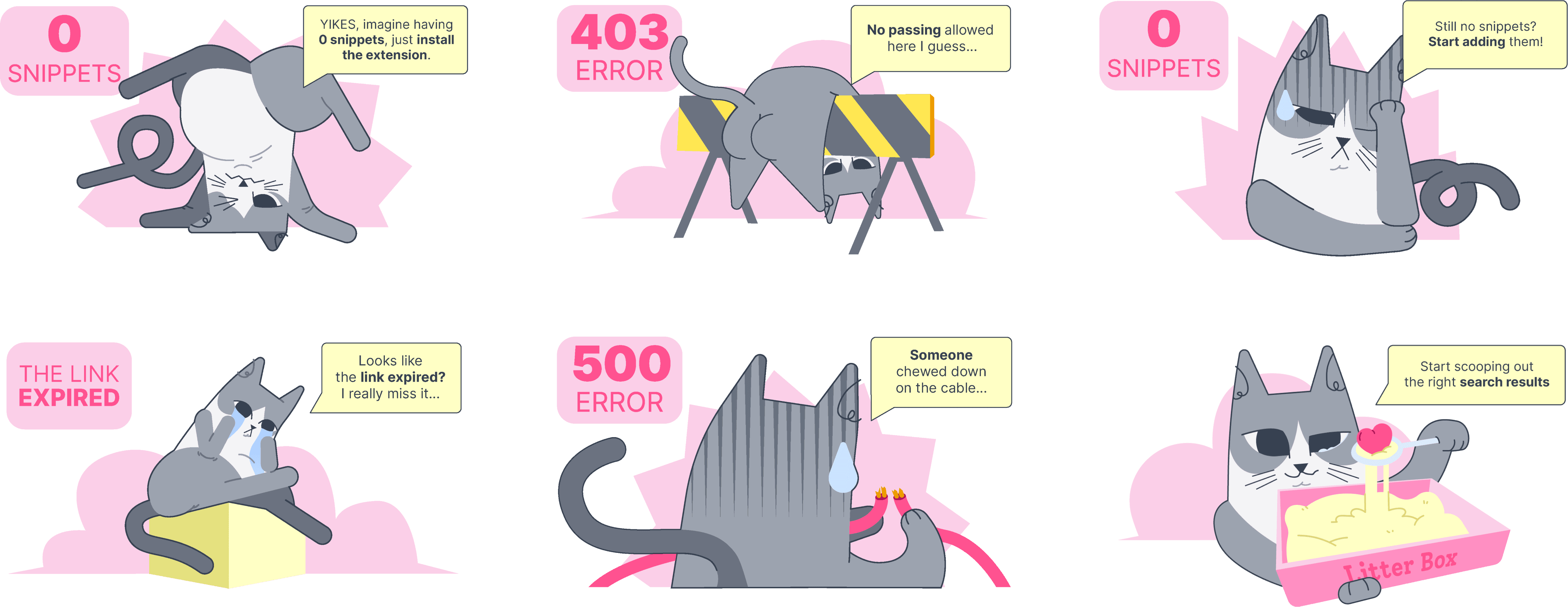
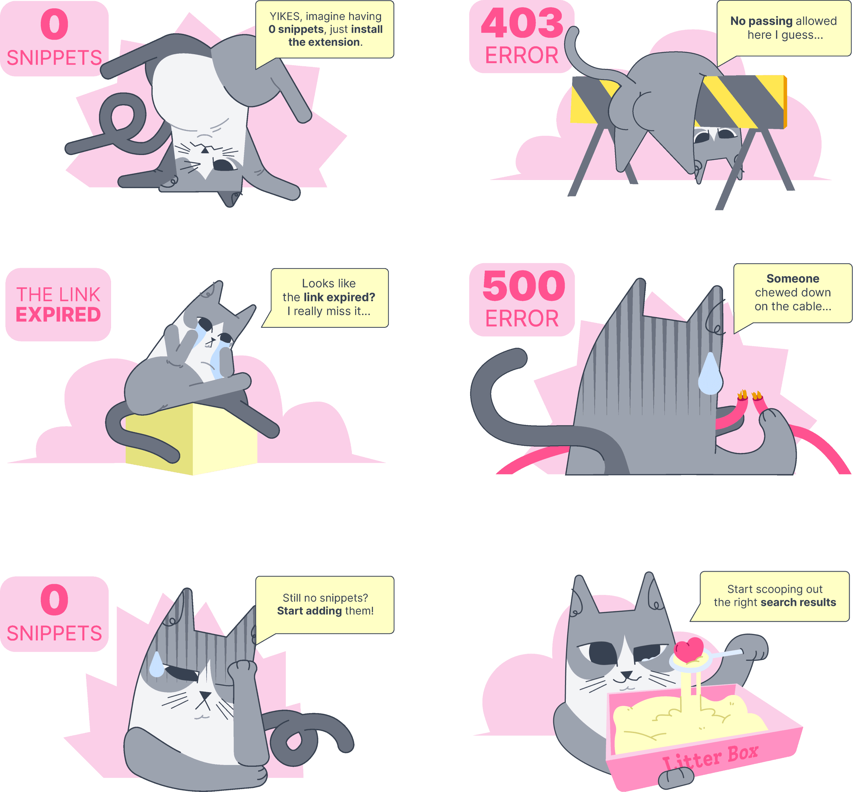
Key feature 1
Tag buckets
(Litter Box)
Charles Darwin always had the theory of evolution inside his notes. Though he didn't have a way to structure them together through tag buckets. Luckily we do now.
Problem
Users needed a simple way to structure scattered research without building complex taxonomies.
Why it matters
People don’t want to “manage tags”. They want meaning groups.
Solution
A visual grouping system allowing users to group snippets by tags, inside of a "non-existing" topic which they can share.
Outcome
Higher organization success rate
Increased activation among marketing + student personas
Key feature 2
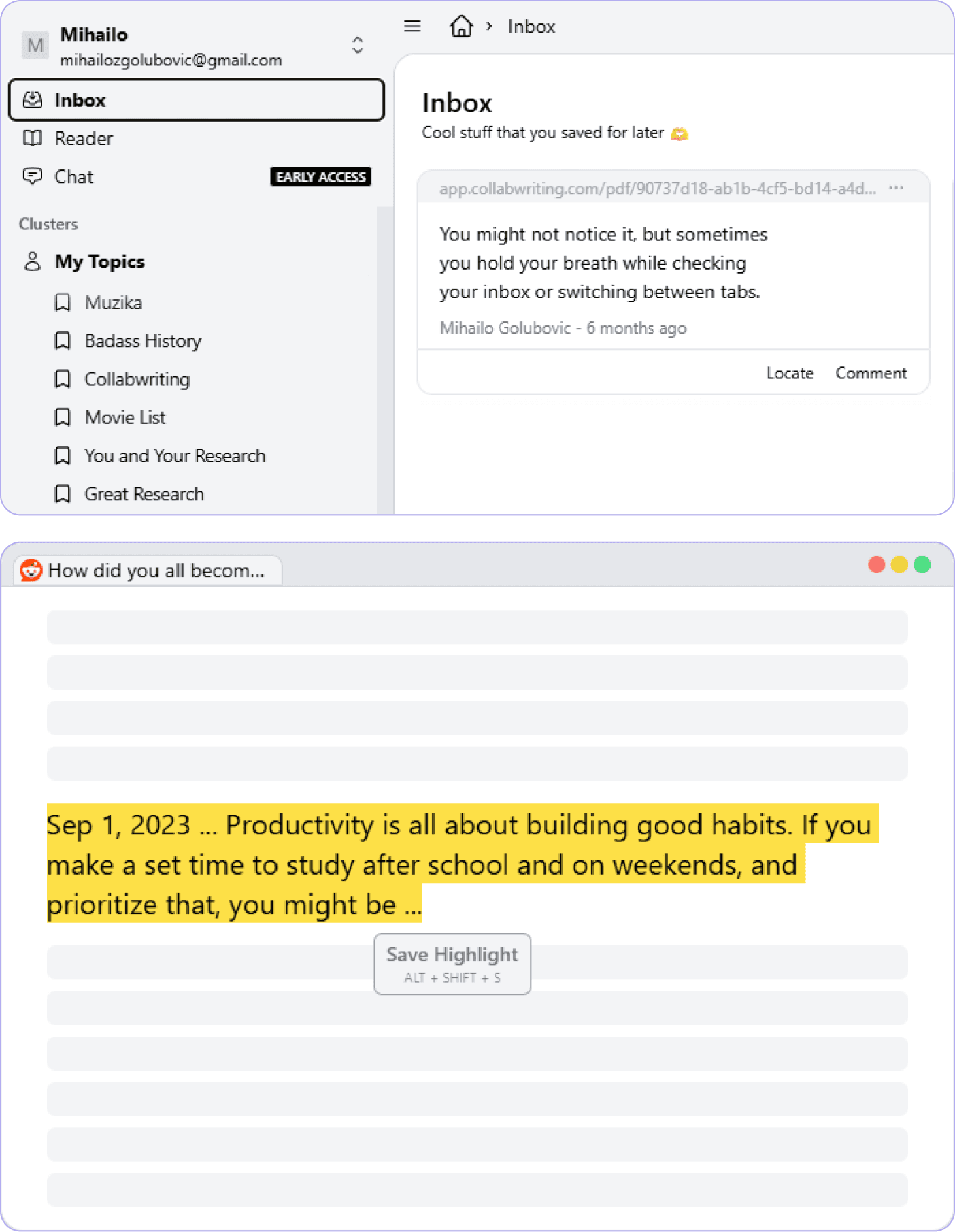
Inbox
The feeling when you hear a song that is too good, but you still didn't find the right playlist on YouTube for it, so you save it for later? The Inbox is just that, but for research on the go.
Problem
Users wanted a faster way of collecting snippets. Sometimes when you're in the zone, you don't have time to search for the right "playlist".
Solution
A separate "Inbox" cluster that would be already active when you use the new highlight saving shortcut ALT+SHIFT+S.
Why it works
Users return when they know the product remembers what they need.
Outcome
The highest contributing feature for the user activation rate.
Key feature 3
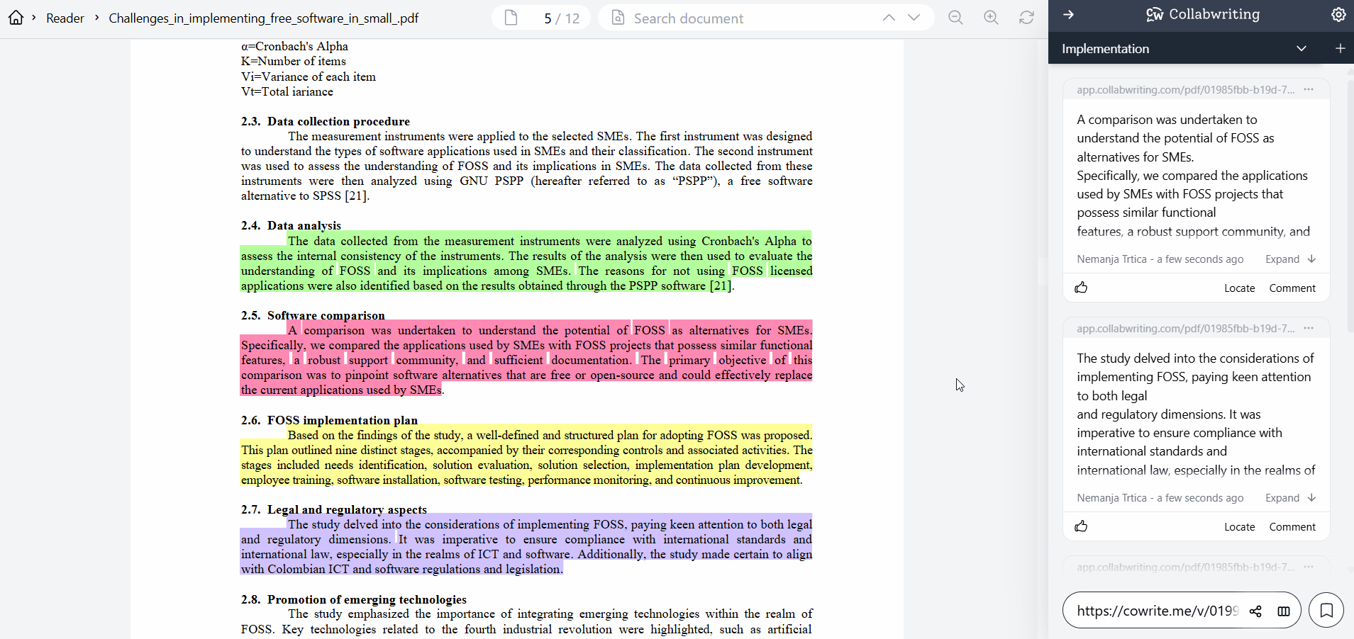
PDF Reader revamp
Students use kindle, lawyers use… law .pdfs.
They together consist about 40% of the active user base. With a non-functional PDF feature, you lose 40% of your userbase.
Students use kindle, lawyers use… law .pdfs. They together consist about 40% of the active user base. With a non-functional PDF feature, you lose 40% of your userbase.
Problem
The users could not view their PDFs on the phone. While on desktop, they had no search bar, zoom options, nor different highlight colors.
Solution
A custom PDF reading + highlighting tool built directly inside Collabwriting, both on desktop and mobile.
Benefits
During the research process, a lot of external tools costed a fortune. Having a native, straight-forward PDF feature was the solution.
Outcome
Major adoption in legal and research-heavy personas
Key feature 4
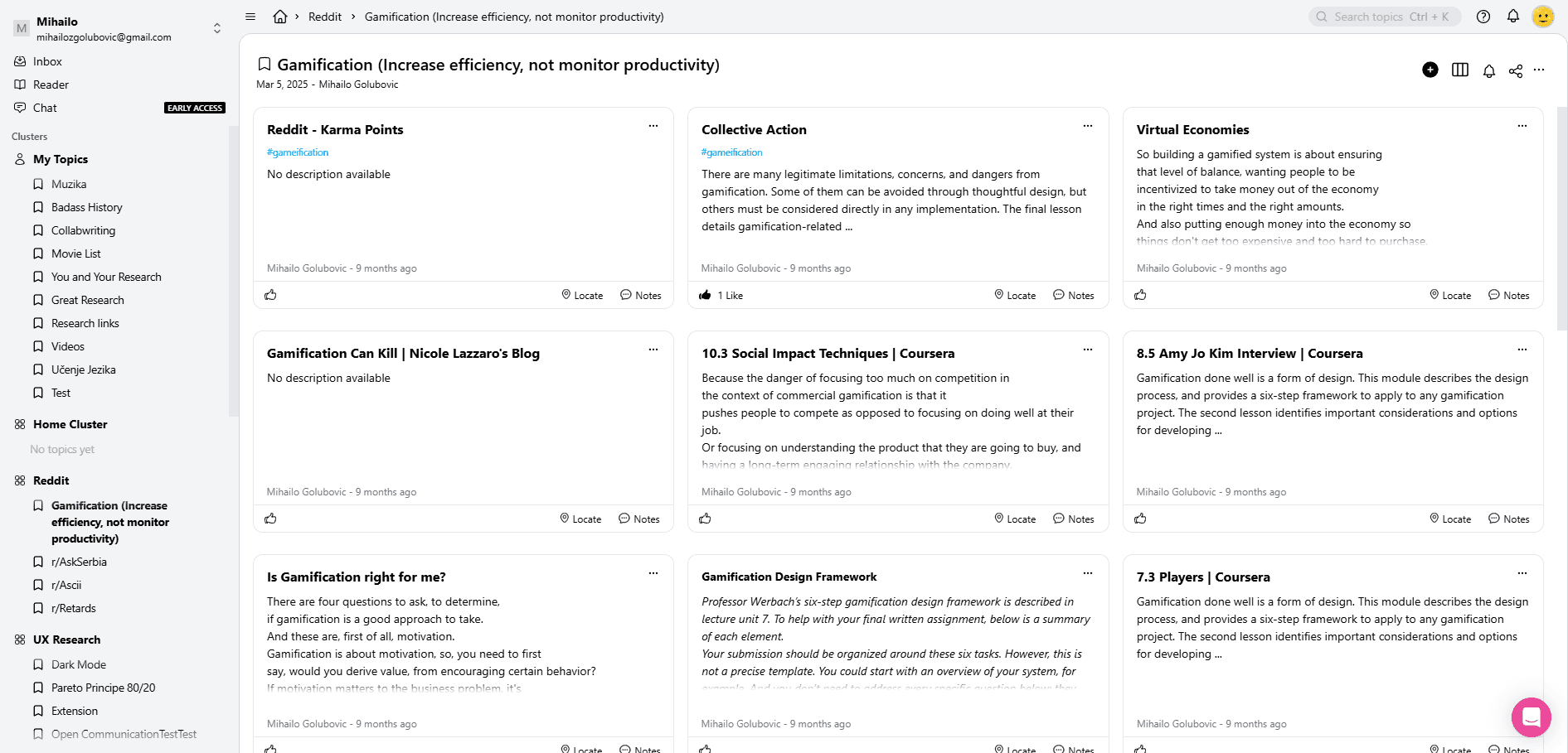
Dashboard redesign
According by many users through the intercom platform, the dashboard felt rigid. Too much information clutter in the left side navigation, losing track of which cluster they are in. The design was not up to par with modern apps.
What Changed
The dark navigation at the top was changed for a seamless breadcrumbs navigation, which allows users to expand the dashboard for a research focused workflow. A much needed home button was added, as well as a clear navigation for users to know in which cluster they currently are.
Why it matters
This is the core unit of Collabwriting.
Improving clarity = improving the whole product.
Alongside the new overhauled dashboard, the snippets gave
Supporting features
Alongside the key features, the supporting features gave more life and aesthetic appeal to the whole product, differentiating it from a vast sea of lifeless and minimalistic products.
Our office CHO Jerry became the face of the app and people loved it!
Features list
Avatar uploading
Icons for Topics & Clusters
Empty state & loading animations
Avatar uploading workflow
The icons workflow
Empty states. Most of these are Lottie animations, but If I were to put them all as gifs, you would get a headache…
Outcomes
Business Metrics
Activation: 13% → 33% in 6 months
Retention: 40% in ~18 months
Dev speed: +20% faster due to design system
Feature adoption: PDF reader, Tag Buckets, Inbox among highest-utilized new features
User Outcomes
Anas find and organize insights 2x faster
Damians process legal PDFs without switching tools
Pauls reduce research chaos and retain context
Company Outcomes
More coherent product story
Scalable foundation for new AI and collaboration features
21%
21%
18%
18%
24%
24%
23%
23%
27%
27%
28%
28%
27%
27%
30%
30%
23%
23%
27%
27%
29%
29%
33%
33%
User activation rates from May of 2025 to August of 2025
What I'd do next
Focus on product evolution, not UI tweaks.
AI-assisted auto-tagging and auto-clustering
Topic-level summarization
Organization templates
Knowledge graphs
Gamification
Smart reminders for forgotten snippets
Offline mode for researchers on the go
Closing words
Collabwriting grew from a fragmented tool into a structured knowledge system. My work helped transform how users save, organize, and rediscover insights. This wasn’t just UI improvement. It was a product shift: from “save things” to “understand things”.
Redesigning how people organize insight
Collabwriting is a knowledge management tool helping teams capture, structure, and rediscover insights.
Role
UX/UI design lead
Timeline
February 2025 -
September 2025
Tools used
Redesigning how people organize insight
Collabwriting is a knowledge management tool helping teams capture, structure, and rediscover insights.
Role
UX/UI design lead
Timeline
February 2025 -
September 2025
Tools used
Copyright © 2025 Pixel Mike. All rights reserved
Results
30%
increased user
user activation rate
20%
increased developer
shipping time
40%
increase in the
user retention rate
100%
increased speed
in user research flow
Context
Collabwriting was growing, but users weren’t activating or returning. The issue wasn’t a lack of features. It was fragmentation: people saved insights, but couldn’t organize, use, or retrieve them efficiently.
The big win
I transformed Collabwriting from a “note dumping tool” into a structured knowledge management system users trust daily.
Problem
Collabwriting didn’t help people bridge Capture → Structure → Retrieval.
Signals from data + feedback
Low activation (13%) showed early friction & unclear value
Retention dips tied to inability to “find what I saved”
Support logs full of “Where did this go?”, “I can’t find my topics”
Teams using PDFs, bookmarks, e-mails, posts, needed structure
18%
22%
16%
14%
18%
17%
25%
21%
16%
16%
17%
10%
User activation rates from February of 2025 to May of 2025
Personas
& Pain Points
Ana
Marketing specialist
Short bio
Collects insights from YouTube, blogs, LinkedIn. A million open tabs, messy research, no structure.
Pain-point
I don’t know where things go. I want one place where my research is actually usable.
Together, these personas reveal the system-level problem: users struggled to transform collected content into actionable knowledge.
Damian
Lawyer
Short bio
Reads long, complex laws and amendments which he collects as snippets inside of his dashboard.
Pain-point
I lose track of what I highlighted. My knowledge becomes scattered across PDFs, notes, and tabs.
Paul
Student
Short bio
Pulls insights from papers, lectures, forums. Lot's of knowledge nuggets but forgets where he saves them.
Pain-point
I never know where I saw something. Half of my research time is hunting for the other half.
Product strategy
To solve the chaos, I created a framework guiding all decisions:
The Retrieval Framework
Capture
Make it effortless to bring content into Collabwriting
(shortcut, quick-save, inbox)
Structure
Give users intuitive, visual ways to organize information
(PDF hub, tag buckets, icons, clusters, topic UI)
Retrieve
Make insights instantly findable and re-usable
(Inbox, snippet redesign, AI chat, improved navigation)
Every feature feeds into this loop. This turns your “many features” into one strategic story.
Key feature 2
Inbox
The feeling when you hear a song that is too good, but you still didn't find the right playlist on YouTube for it, so you save it for later? The Inbox is just that, but for research on the go.
Problem
Users wanted a faster way of collecting snippets. Sometimes when you're in the zone, you don't have time to search for the right "playlist".
Solution
A separate "Inbox" cluster that would be already active when you use the new highlight saving shortcut ALT+SHIFT+S.
Why it works
Users return when they know the product remembers what they need.
Outcome
The highest contributing feature for the user activation rate.
Key feature 3
PDF Reader revamp
Students use kindle, lawyers use… law .pdfs.
They together consist about 40% of the active user base. With a non-functional PDF feature, you lose 40% of your userbase.
Problem
The users could not view their PDFs on the phone. While on desktop, they had no search bar, zoom options, nor different highlight colors.
Solution
A custom PDF reading + highlighting tool built directly inside Collabwriting, both on desktop and mobile.
Benefits
During the research process, a lot of external tools costed a fortune. Having a native, straight-forward PDF feature was the solution.
Outcome
Major adoption in legal and research-heavy personas
What I'd do next
Focus on product evolution, not UI tweaks.
AI-assisted auto-tagging and auto-clustering
Topic-level summarization
Organization templates
Knowledge graphs
Gamification
Smart reminders for forgotten snippets
Offline mode for researchers on the go
Closing words
Collabwriting grew from a fragmented tool into a structured knowledge system. My work helped transform how users save, organize, and rediscover insights. This wasn’t just UI improvement. It was a product shift: from “save things” to “understand things”.
User
Feedback
Via the Sleekplan app, I had access to suggestions from users about bugs, and features. Other community members could vote and leave comments. This way, I would know which features to prioritize.
The most important feedback came from team (enterprise) plan users. I worked with them on qualitative research: 1 on 1 calls and A/B testing. Those sessions helped me create 3 common user personas and their pain-points
Before the overhaul
I rebuilt the interface around clarity, hierarchy, and predictable patterns users could trust. The new design system aligned the entire team, improving both usability and development speed.
Issues to solve
And old looking dashboard with a lacking navigation
A buggy PDF reader that was not existent on mobile
No research customization features for better organizing
A dark and heavy top bar with no navigation, rigid angles and cluttered snippets with too much information.
Key feature 1
Tag buckets
(Litter Box)
Charles Darwin always had the theory of evolution inside his notes. Though he didn't have a way to structure them together through tag buckets. Luckily we do now.
Problem
Users needed a simple way to structure scattered research without building complex taxonomies.
Why it matters
People don’t want to “manage tags”. They want meaning groups.
Solution
A visual grouping system allowing users to group snippets by tags, inside of a "non-existing" topic which they can share.
Outcome
Higher organization success rate
Increased activation among marketing + student personas
Key feature 4
Dashboard redesign
According by many users through the intercom platform, the dashboard felt rigid. Too much information clutter in the left side navigation, losing track of which cluster they are in. The design was not up to par with modern apps.
What Changed
The dark navigation at the top was changed for a seamless breadcrumbs navigation, which allows users to expand the dashboard for a research focused workflow. A much needed home button was added, as well as a clear navigation for users to know in which cluster they currently are.
Why it matters
This is the core unit of Collabwriting.
Improving clarity = improving the whole product.
Alongside the new overhauled dashboard, the snippets gave
The CJM helped me map out the exact points where customers lost retention. Which helped me know exactly which features I should prioritize.
UX Research
By mapping user behavior across marketers, students, and legal professionals, clear patterns emerged around organization and retrieval pain points. These findings shaped the core product direction and guided every major design decision that followed.
Insight 1
Users expected visual cues where they lacked. Especially Ana and students accustomed to Notion-like mental models.
Insight 2
Complex PDFs needed a dedicated workflow. Legal and academic users demanded better reading, highlighting, and referencing.
Insight 3
Inconsistent UI added friction. The research process needs to be as seamless as possible so the users focus solely on the research.
Design
System
I rebuilt the interface around clarity, hierarchy, and predictable patterns users could trust. The new design system aligned the entire team, improving both usability and development speed.
Goals
Unify visual language
Improve speed of execution for engineers
Reduce cognitive load for users
Establish scalable patterns for upcoming features
Impact
20% faster feature development
Reduced UX inconsistencies → more trust + clarity
Enabled rapid iteration for AI Chat, Inbox, and Tag Buckets
Supporting features
Alongside the key features, the supporting features gave more life and aesthetic appeal to the whole product, differentiating it from a vast sea of lifeless and minimalistic products.
Our office CHO Jerry became the face of the app and people loved it!
Features list
Avatar uploading
Icons for Topics & Clusters
Empty state & loading animations
Avatar uploading workflow
The icons workflow
Empty states. Most of these are Lottie animations, but If I were to put them all as gifs, you would get a headache…
Outcomes
Business Metrics
Activation: 13% → 33% in 6 months
Retention: 40% in ~18 months
Dev speed: +20% faster due to design system
Feature adoption: PDF reader, Tag Buckets, Inbox among highest-utilized new features
User Outcomes
Anas find and organize insights 2x faster
Damians process legal PDFs without switching tools
Pauls reduce research chaos and retain context
Company Outcomes
More coherent product story
Scalable foundation for new AI and collaboration features
21%
18%
24%
23%
27%
28%
27%
30%
23%
27%
29%
33%
User activation rates from May of 2025 to August of 2025